 I've always enjoyed graphic arts, logos, drawings in my lifetime. The first time I saw this Werner Electric logo it caught my eye. Bold colors, simplistic, it all works. From the street, it's about 150-200 feet away, which is probably why it's so large. I needed to get nice and close for this shot as my zoom isn't so great from that distance.

June 16, 2011
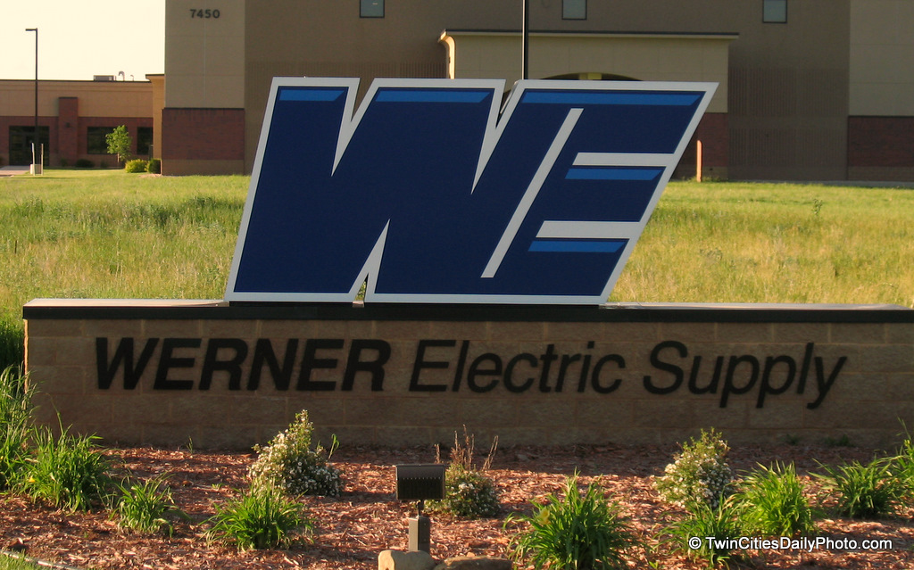
The WE Logo
I've always enjoyed graphic arts, logos, drawings in my lifetime. The first time I saw this Werner Electric logo it caught my eye. Bold colors, simplistic, it all works. From the street, it's about 150-200 feet away, which is probably why it's so large. I needed to get nice and close for this shot as my zoom isn't so great from that distance.
Subscribe to:
Post Comments (Atom)
2 comments:
I Googled Werner Logo and actually came across your photo. It is pretty cool to see someone who appreciates the design of not only our logo but also our monument sign. My brother and I are graphic designers for Werner Electric, and my brother is the one who designed the logo and the monument sign. Thanks so much for stopping to snap a photo and share it with everyone. It is very inspiring!
Have a great day!
This is awesome. Comments like yours is what keeps me going on my photo blog. How awesome is it for the graphic designers of the logo to find my photo and leave a comment!
Post a Comment